Doodle Dump 2
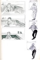
Here is the second batch of drawings from the exercise:
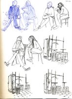
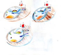
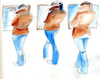
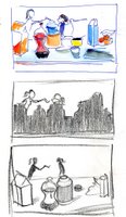
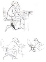
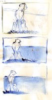
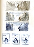
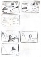
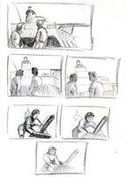
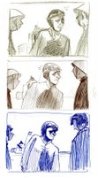

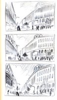
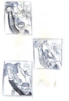
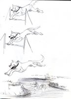
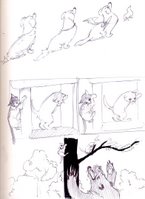
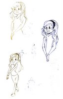
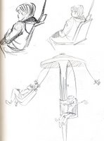

I'm finding that, while playing with the composition/lighting/etc. among each set of three (though changes are still pretty subtle), I begin to think differently about how the emotion of a piece can change dramatically from drawing to drawing. For instance, a friend pointed out that in the set where people are throwing their fists into the air in protest, each frame seems to give the crowd a different intention. To him, the first and last frames show more of a standard protest, while the middle drawing depicts a mob. It's really cool to see responses like this, which show how powerful the arrangement of elements in a scene can be, even when subtle. I'm going to look further into the psychological side of cinematography with Bruce Block's "The Visual Story."
Even though I'm experimenting within each trio of drawings, and ultimately hoping to make the third drawing (memory/imagination) the most powerful, it's kinda become a hit or miss. Sometimes the first drawing is more effective than the other two in terms of what idea I'm trying to convey, and other times all three drawings turn out equally boring for me (i.e. girl w/ brown jacket looking at menu). I think that the third image works well when I let loose with my imagination, and stop trying to memorize what was drawn the first two times; like when I take my impression of a character or scene and stick it in a different, yet believable setting.
In other words, when I actually try to have fun with it!


4 Comments:
I am offended by your use of the word DUMP. Please refrain.
Thank you,
Tina Vaziri
This comment has been removed by the author.
I am offended by the sheer amount of images you've posted in this entry. Please reduce.
Thanks,
Jake
Yeah, it seriously makes me want to kick my own ass into gear. What a great excersize.
Appreciate you bblogging this
Post a Comment
Subscribe to Post Comments [Atom]
<< Home